
June 15, 2020 by Signe Roswall

I very clearly remember the first time I opened up a copy of "Universal Principles of Design," thinking it would be the peak of nerdiness for me as someone who deliberately spent the least possible amount of time in school. This was in 2011 when I was only starting to dip my toes into design, which meant most of the book initially didn't make much sense to me (and still doesn't entirely – full disclosure.)
Back then, I figured that being able to brag that I had read the book and survived it would be better than nothing. I think I even tried memorizing a few, select words so I could throw them out at random to sound like a Smart Person™.
"Why should the button be blue, you ask? Well, I've got just one word for you: cognitive dissonance; that's why!"
Nine years and much more experience memorizing fancy words later, I was recently reminded of the book, thinking I should give it another read. And as I sat down to order a copy, I discovered it had been republished in a "pocket" version, which made me quite hopeful.
But the "Pocket Universal Principles of Design" actually includes 150 design principles instead of the previous 100, which, if anything, really makes you wonder exactly what kind of pockets these people have. 🤔
Nevertheless, I was determined on a reread and, fortunately, discovered that the meaning initially lost to me has later become apparent through working with design.
Inspired by the “Authors’ Favorites” section of the book, I wanted to share some of my own favorite Universal Principles of Design (in no particular order). Obviously, I’d also like to warmly recommend the book; it’s so cheap that it almost feels like stealing.
One of the first principles in the book is also one of my all-time favorites, the 80/20 rule, also known as the Pareto principle. This principle can be applied to almost anything and doesn't have to be 80/20 specifically; it could also be 70/30.
The point of this rule is that the majority of the effect is often caused by a smaller percentage.
This way of thinking or rather focusing becomes especially helpful when prioritizing optimizations, features, or, in my case, when redesigning something.
It's tempting to start at the "bigger" pages of a system or website, such as the front page or dashboard, since they are the "face" of the product. However, they might not be where the majority of the usage or traffic even is. Perhaps most people enter your platform or website through email digests or notifications – going straight to a subpage or a specific view?
Just remember that analytics can be misleading, and high traffic or usage does not only have to happen within the system or on the website itself.
As an example, the "Innovation Ambition Matrix" (which I learned about recently from my boss), is also a variation of sorts of the 80/20 rule to help focus product development.
See also: Hierarchy of Needs, Cost-Benefit
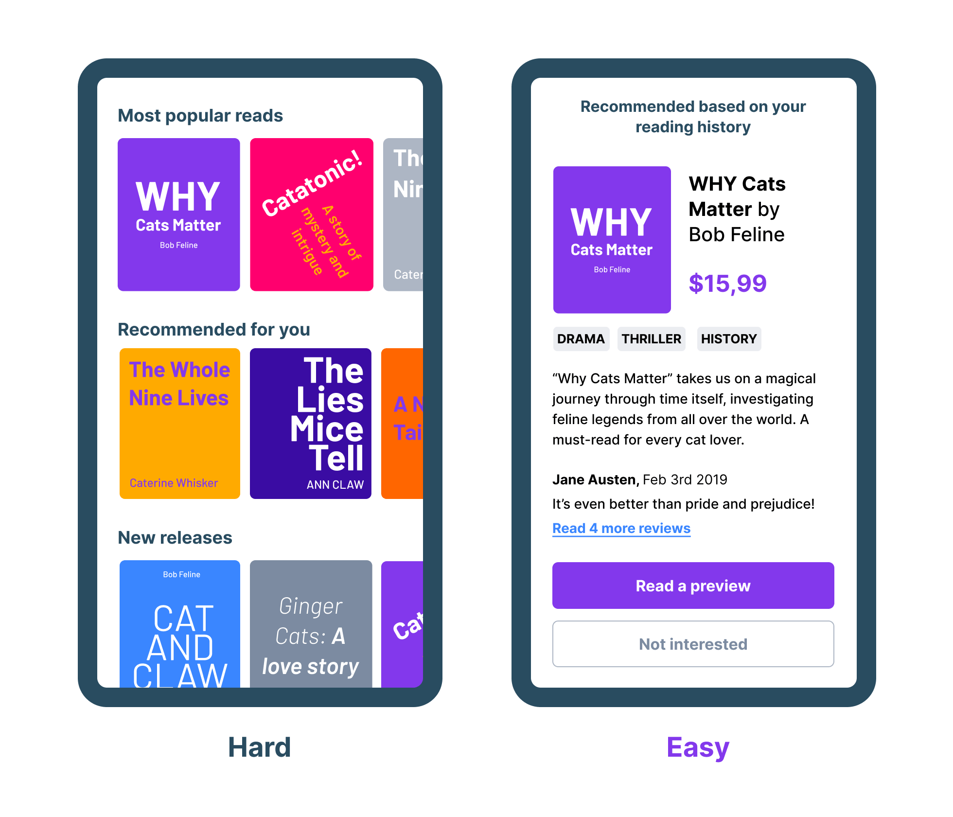
Speaking of analytics, another way to affect usage is by placing things in plain sight. The visibility of information also helps us form an idea of the available options we have and the overall purpose of a design.

Just notice how something as simple as introducing a bottom menu with icons and labels will immediately make us guess what type of app this is even without having any actual content.
More importantly, someone on the lookout for "Games" specifically can quickly find it since it's right there, in plain sight. However, "plain sight" is not always so simple; just because something is placed on a screen does not mean it will be seen.
See also: Affordance, Progressive Disclosure
I remember once in a biology class in school, our teacher made us perform a blind spot test.
The test was looking at a piece of paper that had a plus on one side and a circle on the other.
Focusing on the plus with one eye closed made the circle disappear from view. While this test was designed to point out actual blind spots, it's an excellent metaphor for this principle.

Focus on the X with your left eye closed and bring your face closer to the screen until the circle “disappears”. You can also do this on the circle with your right eye closed.
Similarly, when our brains are focused on a task or finding a specific piece of information, it filters out everything around it, which is unrelated. If you know what you need to find has a red color, you very likely won't notice or remember the other colors while looking for it.
Inattentional Blindness becomes particularly relevant when designing flows or informational pages since small details might be overlooked entirely when giving something our full focus.
If it's crucial that people notice the information, consider giving it its own step in the flow or try highlighting it with color or animation to draw attention. If not, well — consider not having it there at all.
As always, testing designs on others can also help surface these potential "blind spots."
See also: Highlighting, Inverted Triangle
Alright, admitted, this one is perhaps super obvious. Or is it? Because even today, I still see inconsistencies in websites and systems.
While I'm not an opponent of thinking up new ways of doing things, I am a die-hard consistency-nazi in the sense that I could probably design a full feature using just a few components.
Because what is interface design, really, but variations of the same interactive elements?
Consistency makes a design faster to navigate and easier to use. Our subconsciousness will quickly recognize patterns and identify elements necessary for completing actions based on the past behavior of similar objects. All because our brains are... well, lazy.
As an example, the other day, I was ordering takeaway online, and going through the checkout process, a "continue shopping" button was suddenly the primary action in the last step after I'd added my contact information and everything.
I clicked it without reading the label since the previous, identical buttons had sent me onwards in the flow.
Instead, it sent me to the product overview and reset my "cart" too.
Luckily, I was only ordering 2 burgers, 1 chocolate milkshake, fries, and dip so I could quickly recreate the order.

See also: Recognition Over Recall, Similarity, Constancy.
This is also one of my favorites since it still matters even today or perhaps especially today.
In this principle, the "signal" is what's relevant to us, for example, when browsing a website, scrolling through social media, or ordering some butt-shaping yoga-pants.
The "noise" is everything unrelated around it that doesn't give any value, yet still remains because of [insert arbitrary business reasons here].
Imagine if music streaming websites began playing commercials in the middle of your favorite songs. Actually, you don't have to imagine, just try watching a video on YouTube without an active AdBlocker (emphasis on "try.")

Just about every experience I have with websites today starts with dismissing all the frustratingly irrelevant ads, pop-ups, banners, and "important" notices.
This is all noise, disturbing the signal.
But this sadly isn't limited to websites alone, anymore. I've begun noticing how almost every time I open up one of the online tools I use for my work, an onboarding flow for a new feature starts, a pop-up with some information blocks the screen, or a wild chat message appears asking if I need help.
Honestly, it's starting to feel a whole lot like trying to write something in Microsoft Word back when "Clippy" was around.

Source. Clippy is by Microsoft.
In-app messages with feature updates or product advertisements are becoming as bad as the dreaded cookie notices and newsletter pop-ups because they're getting in the way.
"Wait, what do you mean 'getting in the way'?! This is all super relevant to people using the product!"
And sure, it may be valuable information, but not when I'm opening up the tool to get s$*! done. Don't be surprised if people instantly dismiss it without absorbing the content.
Instead, limit it to something noninvasive, in a section of its own with a tiny notification bubble, or consider excluding it altogether and focus efforts on designing intuitively instead.
See also: KISS, Ockham’s Razor
Another classic, Fitt's Law, explains that the time to hit a target depends on the size of it as well as the distance to it. I was hoping we'd be over this one by now in 2020, but for some reason, I still see miniature inputs and buttons more often than I care to.
Seriously, who is it that are supposed to have these tiny fingers? </rant>

According to Fitt's Law, the sign-up form on the right will be easier and faster to complete than the form on the left because of the increased size and reduced distance between the inputs and button.
Small and scattered requires more "aiming," which is especially frustrating when using a mouse cursor (to anyone who doesn't play Counter-Strike professionally.)
Sure, the left example is exaggerated, and luckily most forms today are closer to the one on the right. I imagine it's a question of aesthetic preference, but in terms of usability, bigger is often just better. Also remember Fitt's Law for the actual "hit area" – the invisible bounding box around a target, whether it be a checkbox label, a link, or an icon button.
See also: Form Follows Function
Not to be confused with Fitt's Law (though I did include them right after each other, sorry), Hick's Law teaches us that decisions become harder and take longer to make the more options we have to choose from. This is me almost every time I'm trying to find a new movie on Netflix.
With so many choices right in front of you, which do you choose? "This one looks okay, but... Meh, I better keep scrolling to see if something better comes along."
Before you know it, it's become too late to watch anything, or you grow so tired of scrolling you end up watching "Burlesque" with Christina Aguilera and Cher. Again.
However, with the advanced technology we have at our disposal today, taking an educated guess is not only possible but also essential.
We, The Consumers, expect to get a personalized experience in trade for our personal data. There's gotta be some perks to letting all these services crawl up our backs.
Another downside of showing too many options is the level of detail has to be extremely limited to not cause information overload. And displaying a whole lot of covers with none of the context means people will be spending more time going back and forth between general overview and detail pages.
Instead of “which of these books should I read?” the decision here instead becomes “do I want to read this book?” Which is a much easier and faster decision to make. So, would you? I would!
It's easy and quite natural to favor the results and people that confirm us and our own beliefs, which is what the Confirmation Bias is all about. It can especially become challenging when testing assumptions or design solutions.
We can counteract the bias by:
Giving positive feedback on the unexpected, less-than-good feedback will make people more comfortable speaking their minds, and I believe we'll also become more susceptible to it, ourselves. Going on the defensive and trying to prove we're right isn't being accepting of different opinions. Besides, you can always scream into your hands in the toilet and fish for compliments from your partner, good friend, or a family member, later.
When we're getting into the busy, daily routine of delivering designs under tight deadlines, we should be careful to not sacrifice quality for quantity. Also, no design article would be complete without a quote from a Steve Jobs who actually introduced this principle.
As a craftswoman, I take much pride in the solutions I produce; I'm only as good as the last thing I designed. Nothing frustrates me as much as knowing a design is released unfinished or is poorly executed.
So this is also a plea to the stakeholders and leaders out there, to really make sure to add in a proper buffer for the "back of the dresser"; the edge-cases, the rogue user scenario, the empty states, security and settings, errors, and email notifications especially, – to avoid these things being rushed in the critical moments before a deadline quickly, cheaply–plywood-y.
Of course, it's impossible to cover all the unseen things and edge-cases all the time, and I'm personally not the best example of this either. Things are going to surface along the way.
But for us designers, I think it's vital we push back on the much too tight timelines and try to show the magic we can do when and if given the time. Rushing things in doesn't benefit anyone, not the designers creating it, the company providing it, and much less the people using it.
Meticulous craftsmanship takes time, but it will also be appreciated.
Remember how popular 404 pages became once we realized some companies had actually spent time and effort on them? It became all the rage, and now we all damn well better make sure to have a Star Wars referencing error page. You can tell a lot about a product's quality in the hidden details.

Lastly, the principle that struck me the most.
Because if working in many different startups and scale-ups has shown me anything, it's that there are a lot of companies out there, fighting to build products entirely from scratch. When really, the market for digital services and platforms is pretty oversaturated as it is.
So what I'm starting to wonder is this; why not collaborate and partner up more?
Seriously.
If more companies worked together, we would have better, more complete products with a broader variety of experienced specialists working on it instead of a skeleton crew scrambling to know everything.
Wanting to build and own something for yourself – I completely get that. But bringing more people together will help us go much further, much faster.
Whew, that was incredibly hard since I have a whole lot more favorite principles than only ten! I've included some of them here as honorable mentions:
Forms Follows Function
Accessibility
Iteration
Biophilia Effect
Root Cause
Hanlon’s Razor
...And if you enjoyed this article, here are some other (nerdy) resources:
Thank you for reading!
PS: Want the Figma file with these examples? Grab a free copy here!
Last updated: June 15, 2020