May 27, 2020 by Julija Popovic

To discover the best serif fonts, let's first clear up what they are in the first place (since serif font is quite a broad term).
Serifs are the little lines in continuation of the main stroke of lettering, i.e. the detailing in nearly all letters (O and Q excluded) which make them have the “little feet”.
The origin of the serif is in the roman stone inscription lettering, which then made its way into the first printed fonts in Johannes Gutenberg’s printing press.
The serif fonts were (and are) considered to be more traditional and elegant, as opposed to the sans-serif ones. However, the display quality of the screen can greatly influence their appearance.
Listed below in no particular order are some of the nice serif fonts which can be used for all sorts of design – UI design, posters, logos, headlines, and book covers.
Serif fonts are great for adding a touch of sophistication and formality to any project they are used for. Many of the best fonts are premium, however, we’ve included a few that can be downloaded for free.

This elegant and somewhat exotic looking serif font was designed by Manushi Parikh in 2015.
Its serifs are triangular, and they add a little bit of edge to this otherwise flowing and delicate font. It is especially eye-catching on art exhibition posters or on covers of gallery booklets.
In order to use this font, you can find it here.

This font is oft times described as a mishmash of influences. It was designed by Jorge Cisterna and it has a broad spectrum of uses.
With its angled strokes and distinctly vintage feel to it, an apt description would be that it’s nothing short of groovy.
It’s a bold, joyous, but at the same time stylish and not too overbearing font that lends that fun feeling to whatever project it’s used for.
It’s available for purchase here.

This is a classic, old-face type serif font. The original Garamond font was designed in the 16th century by Claude Garamond.
The digital version most used today is Monotype Garamond, which was developed long before digital fonts would be the norm, in the 1920s. Garamond is recognisable by the small eye of lower case e.
It can be downloaded for free here.

The Romana font was designed by Theophile Beaudoire in 1860.
It has a slightly elongated look to it, with bowls of letters like d and b being usually taller than they are wide.
The strokes themselves, while not too thin and delicate, appear formal. This font just oozes sophistication and it is well suited for logos and headlines.
It is available here.

Hawthorn is quite similar in appearance to Romana, although noticeably bulkier. It was designed in the 1960s by Michael Daines.
That being said, Hawthorn is a statement font. It is as eye-catching as they come without having to sacrifice style and sophistication.
As such, it is ideal for headlines, after all you want to grab the readers’ attention and not let go.
Want this type? Get it here.

This font was designed by Marc Kappeler, Dominik Huber and Noël Leu in 2014. It’s a traditional looking, no-frills font.
However, it is not completely devoid of character, as the angled bowls of letters give it some panache. Its serifs are thin, unlike the heavy, triangular ones of fonts such as Hawthorn.
It is available for purchase here.

Sabon is a bit leaner and sharper in appearance than some serif fonts like Begum.
As such, is ideally suited for both book covers and as a reading font, and for newspaper headlines. Its italicised form is particularly sleek for a slightly casual yet elegant look. It was designed in the 1960s by Jan Tschichold.
You can buy this font here.

The Caslon font was designed by William Caslon in the early 1700s.
Moreover, it's an elegant font which is a continuing favorite among typesetters even until today. Its strokes are usually of a medium thickness, and its serifs are linear.
It is a classic old style type font, and it is well suited as a book or newspaper font.
It can be found here.

This contemporary font was designed by Berlin-based independent foundry Schick Toikka.
It comes in four weights, and it is recognizable by its high contrast, wide and thin strokes and by its bulky triangular serifs.
It’s an energetic and vibrant font that commands attention.
All the weights and corresponding italicized fonts can be purchased directly from the Schick Toikka foundry here.

This font was designed by Lucas Sharp, who drew his inspiration from mid-20th century calligrapher Oscar Ogg.
It is a combination of typeface and calligraphy, with graceful strokes and wedge serifs which offset and give some grounding to the playful lines of the strokes.
In addition, this is an incredibly sophisticated font, and as such it is ideal as for logos and as a script for ceremonial documents, such as wedding invitations or other formal occasions.
Want to learn more? It is for sale right here.

Blacker is another lovely serif font, which can be used for a wide variety of things. It was designed by Cosimo Lorenzo Pancini and Andrea Tartarelli
The designers were influenced by the proportions of 1970s fonts, and the Blacker font certainly shares the flair and panache of this time.
Its triangular serifs and decisive strokes are perfect for headlines, posters and other kinds of projects that require a certain degree of oomph.
If you want to use it, you can find it here.

This font was designed in the 1970s by Herb Lubalin and Ed Benguiat.
Its heavy slab serifs and tight spacing convey a sense of gravity and seriousness.
The ITC Lubalin Graph font has a distinct typeface quality to it – there can be no confusing it with some of the more calligraphic fonts.
The rounded bowls of letters soften this otherwise almost utilitarian font.
It can be purchased here.

Next, this serif typeface font was designed in the early 20th century by Fritz Stelzer and Frank Hinman Pierpont.
Its appearance is quite similar to Times New Roman, as Plantin was one of the primary inspirations for it.
It’s somewhat bulkier in appearance, which adds to its no-nonsense, serious look.
Purchase it here.

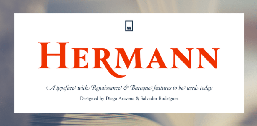
The Hermann font was designed in 2018 by Diego Aravena and Salvador Rodriguez. It is a classic-inspired font that still has a lot of character.
So, its sweeping diagonal strokes give it a grand appearance that captivates the readers’ attention.
For all the grandeur it doesn’t sacrifice legibility, and so it is very well suited as a headline font, but also as a book font.
The Hermann font can be purchased here.

This font, although often perceived as funky and quite mid-century modern, was actually designed by Morris Fuller Benton in the early 20th century.
Its serifs are linear and round, depending on the letter.
As a result, this gives a softer, less forceful look to the text. ITC Clearface has a whimsical storybook quality to it and it’s a perfect font for projects that require a gentler, subtler approach.
It is available here.

This font was designed by Greg Shutters. It is a wide, Clarendon-style titling font which carries an air of old Hollywood film posters.
From its name, one might even assume that it is where the designer drew his inspiration from, but that is not the case.
The main influence is, in fact, the lettering on an early 20th century steamboat of the same name – the S.S. Columbia. Columbia Titling letters are wide, self-assured, much like a stance of a vintage western protagonist in a showdown.
Want more of this font? Click here.

This slab-serif font was designed and published by Hoefler&Co. It is non-threatening, while also having a backbone, the perfect blend of whimsical and solemn.
Since its public debut in 2008, it has been consistently popular nearly to the point of oversaturation.
However, its popularity just confirms it has a pull that draws users to it regardless of its perception.
It can be purchased directly from Hoefler&Co here.

This is another slab-serif, with distinct pointed serifs in certain letters.
It was designed by Jeremy Mickel in 2011. Its appeal lies in its similarity to classic typewriter fonts, while also retaining individuality.
A classic look and sleek design make it an ideal choice for a wide variety of uses.
Slab serifs fonts can, in general but not exclusively, work better for strictly digital projects, as they are less demanding to render on a screen.
Shift font is ready for you to check out here.

The Sentinel font was also designed by Hoefler&Co, and released in 2009. It was created to rectify some of the flaws of existing slab-serif fonts, for example the lack of italicised letters.
This type has a timeless appearance, which in combination with subdued lines gives this font an enormous versatility in use.
In addition, it comes in six weights plus their matching italics.
Want to purchase this font? Click here.

This font, a part of the Gabriela font family, was designed by Antonio Mejia in 2016.
This is a round font, without many sharp edges and as such it is incredibly delicate, the sort of font that one would use for an invitation for a formal afternoon tea.
However, its chunkier weights are quite apt for carrying larger projects and give them an almost flamboyant look that still steers clear of gaudiness.
span style="font-weight: 400;">This is ready for purchase here.

The Albertus font, named for the medieval philosopher Albertus Magnus, was designed in the 1930s by Berthold Wolpe. Although a product of the electrical era, it does carry a strong middle ages vibe to it.
Its elongated lines and slightly slanted serifs evoke a feeling of bygone elegance, without it being too renaissance fair-looking.
It is highly versatile, and a can be a refreshing twist in many designs.
This font can be found here.

The Bell font is a typeface font designed by Richard Austin in the late 1700s.
It is another elegant serif font, with shifting thick and thin strokes.
Also, it has a very formal feeling to it, and one can see it being used as the font for all kinds of gravitas demanding projects.
Bell is altogether classic (and classy) and is best used for headlines, invitations, engravings and the like.
You can pick it up here.

With such a whimsical name, it evokes the serenity of Victorian English countryside, the scent of lavender and baking crumpets.
However, the actual story of Mrs. Eaves is quite the roller coaster, and I recommend looking it up.
The font was designed by Zuzana Licko in 1996, and it is actually an adaptation of the Baskerville typeface font. It is a somewhat delicate yet dependable font, with a vast versatility.
This is a premium font, listed for sale here.

Didot is actually a group of serif fonts, designed in the 1700s by the Didot family, prominent French typesetters of the time.
These fonts are elegant, with thin serifs and fluid (or as fluid as they can get in a typeface font) lines, which alternate between thick and thin, thus creating a chic silhouette that one comes to associate with French haute couture.
As such, it is ideal for a sophisticated logo design.
Didot fonts are available here.

This font was designed by Ed Benguiat in the late 1970s. It carries some resemblance to the art nouveau period lettering, but it is more of an homage than a revival.
The diagonal cross stroke lines in some of the letters give it depth and a degree of je ne sais quoi, which makes it an incredibly eye-catching font.
Discover it right here.

A typeface serif font designed by Veronika Burian and Jose Scaglione, the Athelas font was published in 2008 (and yes my fellow fantasy nerds, it was named by the healing plant athelas or kingsfoil in Tolkien’s works).
It is a classic serif font, primarily intended for use in text bodies.
You can find Athelas here.

The Cheltenham font was designed first designed in the late 19th century by Bertram Goodhue and Ingallis Kimball, later to be perfected by Morris Fuller Benton.
With its decisive lines and classic look it quickly became one of the most popular headline or display fonts.
However, this is not to say that it lacks legibility.
Are you wanting to use this font? Check it out here.

This is an incredibly modern looking font, designed by Ernst Friz and Victor Caruso in the 1960s.
Its lines are assured, but not too severe. Its modern, fun but not frilly appearance can make quite the impression on its readers.
The barely touching lines in the letters give it some lightness which is great for many kinds of projects.
This is a free font that can be downloaded for here.

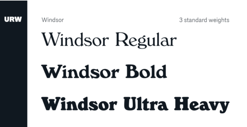
The Windsor font was designed by Eleisha Pechey. It is quite distinctive, with the wide-splayed M and W, and enlarged bowls of Ps and Rs.
It has a vintage feel to it, as many of serif fonts do. Remarkable and memorable as it is, it is therefore far better suited as a headline or logo font, rather than for body text.
It’s available here.

Footlight was designed by Ong Chong Wah, and it is yet another fun (and funky) looking serif font.
It was designed in the mid-1980s, and it certainly has a bit of the over the top 80s flair.
With its thick lines and irregular bowl sizes, it’s definitely eye grabbing. As was the case with the previous Windsor font, Footlight is much better used as a headline and logo font.
The official page for this font is here.

The Literaturnaya font was designed in the late 1930s in the then USSR by Anatolii Shchukin.
Despite it being created in a Cyrillic-writing background, the Literaturnaya a latin font was used in many socialist countries. Its letters are graceful and elongated, and as the name suggests, primarily envisioned as a book body text.
Find out more here.

This is an old style type serif font, and it was designed in the late 1920s by George W. Jones. It was based on the Garamond font, and the similarities are obvious even to a novice.
However, the Granjon font is sharper and pointier and therefore has a bit more edge than the Garamond font.
It can be used as both a body text font and as a headline font, due to its easy legibility.
Learn more about it here.

Last but not least, the Rockwell font is a geometric slab serif font, published in the 1930s by the Monotype Corporation.
It is easily distinguishable by the somewhat heavy-looking slab serif on A. The font as a whole is quite heavy and it gives off the air of playful strength.
Overall, it is quite versatile, be it for printed or digital projects, as the heavy slab serifs are easier to render digitally than daintier ones.
The Rockwell font is certain to hold the readers’ attention.
It’s available for you here.
Last updated: January 10, 2021