In the Beginning: Life Before Responsive Design
Web design as a practice had come a long way since the static pages of the late 90s, nowadays we need to make sure our site or web app runs well on a variety of devices and screen sizes like different sizes of smartphones, tablets, laptops and desktop computers.
The craft of designing for the web is always evolving, I remember when the smartphone revolution was in its infancy, it was very popular to build two separate web sites, one for “real computers” (desktop and laptops) and another for smartphones.
These websites were literally two separate projects with their own domains, both sometimes share the same database, sometimes not.
One was usually with the “real” domain for “real” computers (for example: www.domain.com) and another domain for mobile with the letter “m” somewhere in the domain name (for example: www.m.domain.com)
This led to a big problem, now we have two separate products to maintain and it’s a lot of unnecessary work, think of a news site breaking a story at 4AM on the “real” site, will the same team have the energy at 4AM to update the mobile site as well, probably not.

Enter: Responsive Design
Responsive Design is the method of making one web site “fit” in all device sizes automatically, this way we can build it once and run it everywhere, the same content will just render differently on different devices.
This method has a few advantages:
1. Your domain is the same domain, no matter the device you’re on. Think of a user sending himself a link from his phone to his laptop, in the historical method (with www.m.domain.com) he will get the mobile site on his laptop by mistake.
2. The code automatically makes itself work on whatever device you’re on, that means your web site will fit any future devices that might not even exist yet, of course tweaking it will be necessary sometimes, as we can’t really predict the future, but we have much better odds than just building two web sites for computers and mobile, think of tablets for example.
3. By targeting a device size and not only device type (computers and mobile) your project will automatically work with devices like low resolution laptops, as they might be rendered as mobile phones in the first approach, laptops running android (yes, those exist) or 4k, 5k and 8k displays, as all your content can expand to fill them up.
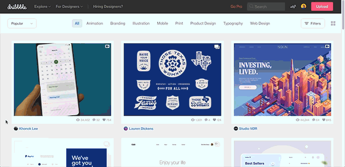
Dribbble is a great example of a responsive website
Figma Responsive Design Tutorial
Figma offers a great way of designing websites and app screens, and it has many advantages over designing static images. As we once did in other design programs, its advantages include the ability to reuse components and styles, to prototype your design to see if it’s working before developing it, and of course the ability to make your design responsive.
Responsive design in Figma is always size based, so it will change if you change the size of an object or a frame, it’s much more useful this way, if it was device based you would need to physically move to a different device to see the effect. Size based means you can see it change in real time while you design it.
One caveat regarding Figma, it’s not always representative of real-world code architecture, as the design team behind Figma wants you to be able to design freely and not be worried about DOM structure, also in responsive design.

Mobile app transforming to a tablet app with a few constraints
Figma’s responsive design aims to give you and your team an idea of how things should look once the device scales up or down, not how it actually reflows to fill the frame necessarily.
Having said that, it might still be useful to design a desktop site and a mobile site separately, as those will require intricate media queries to flow the content perfectly, but different size mobile phones will work perfectly in relation to one another, and even phones and tablets should work pretty well.
Think of Figma here as a playground for different kinds of responsive designs, just like it’s a playground for different design aspects, it doesn’t generate perfect code for development, but it gives the developers a pretty good idea how it should look and work, responsive design is no different, it’s a good idea but not perfect.
Design with Constraints
The first and most powerful way to convey responsiveness in Figma is constraints, it makes a certain object (or component) interact and react with its frame, so it can fit on different size frames and still make sense.
In Figma, every object can refer to its point of reference, this point can refer to 2 axes, horizontal and vertical and just like in CSS, the default point of reference for new objects is the top left of the frame (the artboard).

Top + left constraints in Figma
We can of course change this behavior by selecting the object we want to change and then go to the “Constraints” section in our “Design” tab on our right. Here we can define the point of reference of our selected object.

Where to adjust your Figma constraints
These constraints are separated to the horizontal and vertical axes for more control. Once we change them we can see the effect on our selected object. The object will refer to it when the frame will change its size, giving us the responsive behavior we want.
Here we have 3 blue rectangles on a white square frame. Each rectangle has a different point of reference, one rectangle refers to the top left (the default), the second one refers to the frame’s center on both axes and the last one refers to the bottom right, now when we change the size of the frame watch what happens.

Three identical rectangles with different constraints
When choosing constraints, we don’t have to choose sides necessarily, sometimes we’ll want our objects to be affected by both left & right (or top & bottom), for that we do have a constraint called “Left & Right”.
These constraints will scale your object but unlike the “Scale” constraints they won’t scale your margins, and they might get to a negative value which will result in a mirror image of your object.
Scale is relative to the frame, so it can never drop to the negative zone unless your entire frame gets flipped.
These differences might be subtle in your product, but they’re very important to understand, as you can see in the example below.

Scale constraints vs Left & Right, Top & Bottom constraints
By cleverly adjusting our constraints, we can go from an app designed for mobile phones to an app designed for tablets, or small screens or whatever screen size we can think of, just by resizing our frames, as seen below.
This doesn’t change your layout of course, which you might want to do when you take a mobile app and adjusting it to a laptop view for example, but it does give you the freedom to skip a lot of devices in the middle.

Mobile app transforming to a tablet app with a few constraints
Tablet view can totally be derived from this mobile view, and so on other mobile views. You don’t really need to “fit” your content in different phones as we once did. I no longer design iPhone 6 and iPhone X for example, I only design iPhone X and let Figma do the “fitting” for me.
Sometimes we need to convey a responsive layout inside our object, not in relation to its parent frame but in relation to its content, think of a button getting bigger as its content grows, here we need Auto Layout.
Auto Layout in Figma
Figma’s Auto Layout gives us the ability to make our object respond to its content, in the example below you can see how the text “pushes” the button to grow bigger.

Button with Auto-Layout - notice how the text indicates the width of the button
Making this button with Auto Layout isn’t very complicated, all we need to do is to make a new textbox and add Auto Layout to it by selecting the textbox, right click on it and select “Add Auto Layout” from the context menu (or just use Shift+A to do it quickly).
Once we added Auto Layout to our text, it becomes a frame with an Auto Layout icon instead of the regular frame icon in the Layers panel.

Auto Layout icon vs regular frame icon in the Layers panel
After that we can add a fill color to our Auto Layout frame (I added a blue color) and we can change the corner radius to our liking (I also added a drop shadow effect to it) and that’s it, we got an Auto Layout button now.
We can also make changes to our Auto Layout section in our Design panel, which is only visible when we select an Auto Layout enabled frame.
In this panel we can change the padding Figma will leave around our text, we can change the horizontal padding and vertical padding separately, which is really useful, we can also change the kind of Auto Layout we want from horizontal to vertical (for stuff other than buttons) and we can determine the space between objects, in case we have multiple buttons for example.

We can of course mix it up by making Auto Layout inside another Auto Layout frame, this way we can create a frame with both vertical and horizontal Auto Layout capabilities.
In the example below the text “pushes” the button down while the button’s label “pushes” the button’s width, and thus makes our layout a lot more flexible.
Notice how the icon plays a part in the button’s Auto Layout setup, both the star icon and the text are inside the Auto Layout frame, with the spacing between them derived from the Auto Layout panel, this way the icon is as responsive as the text itself, and they both work together.

Fitting it All Together
Now that we have our Auto Layout, let’s try to mix it with the constraints we saw earlier. Notice that the constraints on Auto Layout frames will effect the alignment of texts.
Also, Auto Layout frames cannot get Scale constraints. Once we gave the Auto Layout the ability to scale the frame, it cannot be scaled by the constraints, sounds reasonable to me.
We can’t apply Left & Right constraint to it either (or Top & Bottom) for the same reasons. Those constraints are just another type of Scale constraint, as mentioned in the “Design with Constraints” chapter in this article.

Figma Responsive Demonstration
Now that we have our Auto Layout, let’s try to mix it with the constraints we saw earlier. Notice that the constraints on Auto Layout frames will effect the alignment of texts.
Also, Auto Layout frames cannot get Scale constraints. Once we gave the Auto Layout the ability to scale the frame, it cannot be scaled by the constraints, sounds reasonable to me.
We can’t apply Left & Right constraint to it either (or Top & Bottom) for the same reasons. Those constraints are just another type of Scale constraint, as mentioned in the “Design with Constraints” chapter in this article.

All these screens were made from the same responsive layout automatically
Summary
We learned a lot about responsive design here, we started with a history lesson about the dark ages of web design, then came the smartphone revolution and now responsive design is just a part of how the web works.
Figma has some great tools to cope with that, we saw how we can design responsively using constraints and Auto Layout frames to insure our content always fits our design.
These tricks we learned aren’t magic, and as I said in the first chapter, don’t expect all your screens to look as sharp as you’d have done as a designer, surely those auto generated screens would have designed differently.
In my example above I can say that I would have tweaked the mobile devices’ designs, especially the iPhone X, I would make the earth image bigger, I would enlarge the text and tweak the button to feel more touch-friendly, I would also change the corner radius to complement the physical device’s rounded corners.
Having said that, it’s still possible to tweak it, those frames are a great starting point to work from, and on some devices, like different size desktops and iPads (and tablets in general) it did such a great job that I wouldn’t change a thing, and that’s quite powerful.

My original design for the Pink Planet, original Earth image from NASA
I hope you enjoyed this article and learned something new, if you did I’ll be happy to hear about it, please follow me on Twitter or find more of my writings at Medium, I would also love it if you’ll check out my quite new Dribbble account.