While there are many whiteboard collaboration tools available for design teams to use, FigJam from Figma is perhaps the most effective. With an increasing number of design teams working remotely, it has never been more vital to have access to cloud-based collaboration tools.
If you want to have a smooth workflow, you are going to need the right tools and resources at your disposal. At SaaS Design, we believe FigJam is an essential tool for cross-team communication between designers and project managers.
FigJam is certainly shaking things up in the design industry. Many teams are switching over from Miro because of the impressive functionality offered by Figma.
After all, FigJam can help you create a seamless workflow. If you’re struggling to distribute and receive actional feedback on design projects, this application could prove to be the missing piece of the puzzle for your project workflow.
When this collaboration tool first entered the scene, I became very excited. As I’ve seen this tool in action, my excitement has only grown for designers across the globe.
The Figma development team has been hard at work building FigJam. These guys are serious about disrupting the online whiteboarding tool space - and you can see this in the end-product.
FigJam is now being compared with other more established collaborative product-focused solutions like Miro, Mural, and Whimsical. In this guide, I am going to tell you why FigJam lives up to the ever-growing hype.
The following questions will be explored:
- How can you use FigJam Figma?
- Why should design teams use it?
- How does this compare to other online whiteboards?
- Do online whiteboards boost team productivity?
- How much does FigJam cost?
- How can you get started with FigJam?
How can you use FigJam Figma?
FigJam is the latest development from the Figma team. This web-based application has been designed to challenge the likes of Miro, Mural, and Whimsical.
UX and product designers only have time to be using the best applications for cross-team collaboration. With this in mind, they are not going to settle for an application that fails to fully meet their needs.
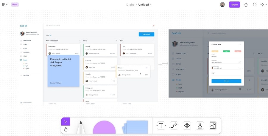
FigJam is a whiteboard collaboration tool for designers to brainstorm and organize their ideas. Gone are the days of jotting down notes on pieces of paper and passing them across the office.
Today, this practice can be done digitally with the support of a whiteboard tool. It really has never been easier to bring your entire team together in a digital space to collaborate on a project.
You can think of FigJam as being a place where team members can come together to explore ideas. It is, in many ways, the perfect environment for the world we are living in today.
As more designers work remotely, cross-team collaboration in a physical location is no longer possible. This is why it has never been more important for your team to have access to smart collaboration tools like FigJam.
Here are just a few common uses of FigJam:
- Brainstorming and exploring product ideas.
- Creating mind maps, decision trees, and design diagrams.
- Running extensive feedback sessions on project design ideas.
- Planning and running design tutorials and interactive sessions.
Once you start using this application, you will quickly realize that the possibilities are endless. Design teams from across the globe are using this tool to harness the collective brainpower of every team member.
In other words, a tool like this could help to break down barriers between remote working team members and facilitate important conversations. The more communication there is between individual designers and project managers, the more efficient the workflow will be.
It’s often easy for design teams to become echo chambers. A whiteboarding tool can be used to collect feedback and encourage designers to raise questions that otherwise wouldn’t be asked.
When you have a tool making it easy for you to collect and receive feedback from other team members, this makes the process of collaboration much more convenient. This is why Figma’s whiteboarding tool can prove to be so useful for remote teams.
If you want to build and riff on ideas together, FigJam makes this possible. It’s rare to find a tool that effortlessly encourages self-expression.
While many whiteboarding tools provide you with everything you need to communicate ideas, the platforms can often feel a little clunky. FigJam files feel both lightweight and inclusive - meaning anyone can jump in and take part.
You can use markers, shapes, and connectors to bring order to your thoughts and illustrate your ideas. These ideas can also be communicated through sticky notes which can be plastered across the FigJam screen.
Why should design teams be using it?
If your design team is actively using Figma and overlooking the potential value of FigJam, you are operating at a significant disadvantage. Now is the time to take this tool for a test drive.
As teams adapt to the challenges of remote working, you should embrace the opportunity to try new design tools that facilitate cross-team collaboration and communication. I believe that all design teams using Figma could potentially benefit from giving FigJam a spin.
Designers are now spoilt for choice with a range of tools at their disposal. Collaboration from afar has never been easier.
When it comes to using FigJam for design projects, there’s plenty to be excited about. It’s so straightforward that anyone can start jamming inside a session.
The best bit? FigJam and Figma are closely connected.
This means you can essentially paste your Figma frames directly into FigJam for annotation. These two applications can operate side-by-side so that everything can be found in one place.
There’s nothing worse than having to rummage through pages of notes in an entirely separate application. Fortunately, with Figma and FigJam, referencing design feedback is easy.
To the frustration of many, most online whiteboard tools cannot be integrated with the designer’s application of choice. The emergence of FigJam is proving to be a total game-changer for designers that have long been trying to manage an inefficient workflow.
With the existence of this new feature, acting on feedback just got a whole lot easier. You won’t have to worry about any delays because the files are updated in real-time - instantly bringing everyone up to speed.
When collaborating on a project, team members are able to leverage the design libraries inside FigJam. This enables teams to create artifacts that are both consistent and on-brand.
How does it compare to other online whiteboards?
Of course, there’s no shortage of online whiteboard tools on the market for designers to choose from. While this is the case, there are some clear advantages to using Figma.
Rather than operating as an entirely separate application, FigJam is really just a lightweight version of Figma that’s even easier and more fun to use.
There’s plenty of functionality built into FigJam that makes it a great centralized hub for early-stage design thinking. At the same time, this application is also incredibly useful for teams working on design projects that are in later stages of development.
While Miro has become a popular platform for designers to use, it doesn’t have the exact same type of functionality offered by FigJam. Figma’s solution can also prove to be much faster than Miro.
The dotted grid never proves to be too imposing - giving designers the freedom to work with the right level of opacity. For the most part, FigJam’s interface is only ever intuitive and easy to use.
Figma’s developers have been able to make the whole interface extremely simple yet powerful. After speaking with other designers about their experiences using this tool, several features are continually brought up in conversation.
The bottom panel of tools is often seen as being very user-friendly because you can find what you need in no time at all.
What makes FigJam really stand out from many of these solutions is that you’ll no longer have to use a whiteboard tool along with a design integration. Instead, everything is all in one place and it always works as expected. It’s intuitive.
After all, predictability can put the mind of a designer at ease. When you’re working with tools that you can quickly navigate through, this can really prove to be a blessing for your workflow.
FigJam files can be heavily personalized to help you illustrate ideas and concepts. The stickers with user avatars enable you to clearly see who has been contributing to a file.
It's quite fun to use, as well — as your team can add their own personality to the files. The stickers and other fun components make this the ideal tool for those classic “breaking the ice” interactions between team members.
Ideation and brainstorming should be a fun experience for all involved. With this in mind, the tools you use for these activities should reflect the mood and atmosphere you’re trying to create.
Do online whiteboards boost team productivity?
When it comes to boosting team productivity and engagement, online whiteboard tools offer tremendous potential. If utilized correctly, an online whiteboard tool can be a centralized hub for ideation and brainstorming.
Online whiteboards can prove to be both lighthearted and highly productive environments. There’s no reason why productivity has to come at the expense of being in a positive digital environment that has been developed to fuel creativity and boost cross-team communication.
Teams working with online whiteboard tools like FigJam are enhancing their ability to collaborate from afar by communicating inside files that update in real-time.
Centralizing team ideation and brainstorming inside an online whiteboard can save hours of back-and-forth communication. With FigJam files updating in real-time, everyone can be quickly brought up to speed with the latest developments.
How exactly does FigJam connect with the rest of Figma?
Designs can be easily copied and pasted from Figma into FigJam. This helps to provide a seamless experience that makes it much easier to arrange objects than in other apps.
If you’ve been working on a project in Figma, you can quickly copy and paste the components into FigJam for other team members to review. They can provide you with feedback by adding sticky notes and other annotations to the file in real-time.
Have you been looking for a consistent working environment? If you’re tired of importing and exporting files across multiple platforms, you should consider the merits of Figma and FigJam.
With more UX designers turning to Figma for projects of every size and scale, this has become one of the go-to applications for the industry.
How much does FigJam cost?
The pricing structure of FigJam is different from other online whiteboard tools. With Miro, you can have one license and share editable files with multiple users.
To edit a FigJam board, the setup is slightly different. It is free to use while in beta through 2021. After that, you have to purchase a new license for every editor.
So, if you have several team members that need to collaborate on a single file, you will have to pay for that in the future.
How can you get started?
On a positive note, you can get started with FigJam for free. This will give you the chance to give the application a test drive to see whether it works for your team.
With hundreds of UI templates at your disposal, it has never been easier to communicate your ideas. You do not need to be a professional designer to experience success with Figma.
In combination with FigJam, you will be able to quickly get design feedback from peers and have a completed project in no time at all.
Anyway, we hope you knock your next design project out of the park!